Wood Type

I've been teaching at Wells College this semester, and while on campus, I've been doing some preliminary tests in wood type at the Wells Book Arts Center. Since my days at Women's Studio Workshop (2005), I've had a real fondness for letterpress type. As I continue work on my book project, I've been stuck on how to deal with the text in terms of the placement, font and scale.
The book is about the wisdom of trees and the parallels to human experience, and it's also all photographic in nature, so I thought it would be fitting to preserve the quality of the wood through wood type in some way. I had first planned to set the type, print and scan it, but as I thought more, I considered the possibility of photographing the wood type and mirroring it. I did a test by setting the type, photographing it and flipping it horizontally in postproduction. As you can see, I got confused with 'you'. It’s really challenging to think backwards! I think it will take a bit of practice and the use of mirror if I do decide to continue in this way. It's kind of a wacky idea, but this test has me curious if it could work for the book. I do love the way the text seems to glow.
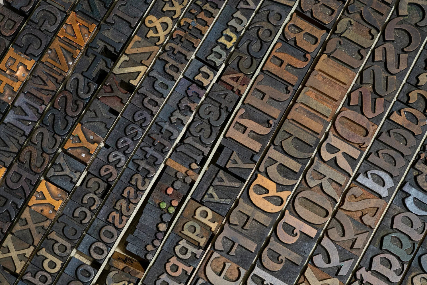
There is an extensive collection of typefaces at the Wells Book Arts Center, however, several of the wood type cases are missing some letters, particularly in the larger font sizes. I found a complete typeface in wood that was labeled "Unidentified" in case #24 alongside “Bradley Extended” and “Devinne XX Condensed”. Overall, I think that this mystery font is a good fit for the text of the book. The '?' is maybe a little too stylized, but it's growing on me.